Guide
Best Fountain Pens for Calligraphy: Italic, Stub, and Flex Nib Picks
Published: 2026-04-29 · Updated: 2026-04-29
I came to fountain pens through calligraphy, not the other way around. A friend handed me a dip pen and a pot of walnut ink in 2019, told me to copy out an alphabet, and I ended up with ink on my forearm, on the cat, and a smear across the kitchen tile that is, I am told, still faintly visible. Two months later I bought a Lamy Safari with a 1.5 mm italic nib and the world quietly rearranged itself. The mess went away. The line variation stayed. I could practice at a cafe table without looking like I had committed a small crime.
This guide is everything I wish someone had told me back then. We will cover why fountain pens are a sensible entry point for calligraphy and italic writing, the three main nib types you actually need to understand, my honest picks at each budget, ink and paper that will not sabotage you, and the practice exercises that finally got my letters consistent. There is a comparison table near the end and a long FAQ.
Why fountain pens (and not dip pens)
Dip pens are wonderful and I still use mine for pointed-pen scripts. But for someone learning, a fountain pen has three real advantages.
The first is consistent ink flow. A dip pen gives you maybe ten to fifteen letters before the ink is gone and the line gets scratchy. A fountain pen with a converter or cartridge gives you pages. You stop thinking about the tool and start thinking about the letterforms, which is where all the actual learning happens.
The second is portability without disaster. A capped fountain pen rides in a bag. A dip pen needs a flat surface, an ink bottle, blotting paper, and patience. I practiced italic on commuter trains for a year using a TWSBI Eco. Try that with a Hunt 101.
The third is lower cognitive load for beginners. With a dip pen you are managing nib pressure, ink load, hand angle, and paper grain all at once. A fountain pen takes the ink-load variable off your plate, so you can focus on stroke direction and letter spacing. Once those click, you can graduate to dip pens for the more dramatic scripts.
The trade-off: fountain pen nibs are less expressive than a true flex dip nib. Even the bendiest modern flex nib will not give you the hairlines and swells of a vintage Spencerian setup. So if your goal is Copperplate or Spencerian specifically, a dip pen is still the right tool. For italic, foundational hand, uncial, blackletter, and modern brush-style lettering, a fountain pen is more than enough.
Nib types: italic, stub, and flex
I see beginners conflate these three constantly. They are not the same. Pick the wrong one and you will fight your pen for months.
Italic nibs are sharp-edged. Imagine a tiny chisel: the corners are crisp, the edges are flat. They produce strong line variation (thick downstrokes, thin sidestrokes) and they require you to hold the pen at a consistent angle, usually around 30 to 45 degrees from the baseline. They are not forgiving. If your hand twists, the line breaks or skips. But the contrast is beautiful and they are the right starting point for traditional italic and foundational scripts. Lamy makes them in 1.1, 1.5, and 1.9 mm widths.
Stub nibs are like italic nibs with the corners rounded off. You still get noticeable line variation, but the edges are smoothed so the nib glides across the page even when your angle drifts. This makes them dramatically more forgiving for everyday writing and for beginners. A 1.1 mm stub will give you about 70% of the line variation of a 1.1 mm italic with maybe 30% of the frustration. Most fountain pen brands offer stubs as a regular nib option. I use a stub for journaling and an italic for actual practice sheets.
Flex nibs work on a completely different principle. They are pressure-sensitive: push down and the tines spread apart, producing a thicker line; release pressure and the line snaps back to thin. This gives you Copperplate-style swells. Real vintage flex nibs (made before about 1940) had soft gold tines that flexed easily. Modern flex nibs are mostly compromises. Some are stiff “semi-flex,” some are very soft but very fragile, and a few are actually good. We will get into specific picks below.
A simple rule: if you do not know which to start with, get a 1.1 mm stub. It teaches you line variation without punishing you for inconsistency.
Best italic nibs
Lamy Safari calligraphy set (1.1 / 1.5 / 1.9 mm) is the answer to “where do I start” 90% of the time. It costs less than a single decent dip pen, the nibs are genuinely sharp italics (not stubs in disguise), and the triangular grip section enforces a consistent hand angle whether you want it to or not. Some people hate that grip; for calligraphy practice, where consistency is the whole game, I think it is a feature. The 1.5 mm is the sweet spot for most beginners. The 1.9 mm is dramatic and great for headers and signage practice. The 1.1 mm is for smaller daily writing. You can swap nibs in seconds, which is the real party trick.
Pilot Plumix is the dark horse pick. It is plastic, it looks like a school supply, and the medium italic nib it ships with is one of the best entry-level italic nibs I have used. Smoother than the Lamy. Costs about the same as a movie ticket. The cartridges are proprietary Pilot, which is a minor annoyance, but you can refill them with a syringe and any ink you like.
Pilot Parallel Pen (1.5 / 2.4 / 3.8 / 6.0 mm) is technically not the same kind of nib (it is two flat plates pressed together rather than a true italic) but the result for calligraphy is excellent. The 3.8 mm and 6.0 mm sizes are the only practical way to get fountain-pen-style broad-edge writing for blackletter or large foundational hand without going to dip pens. The wider sizes are essentially purpose-built calligraphy tools.
Best stub nibs
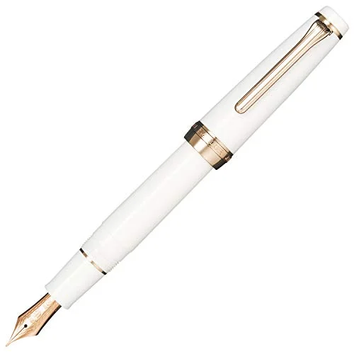
TWSBI Eco with 1.1 mm stub is what I recommend more than any other pen, full stop. The Eco is a piston-filler (you fill it directly from a bottle, no converter needed) with a clear ink window so you can see your ink supply. The 1.1 stub is smooth, lays down a wet line, and the pen holds enough ink for an entire practice session. For comparison shopping between this pen and the Lamy Safari, see Lamy Safari vs TWSBI Eco. Mine has been daily-driven for three years.
Pilot Custom 74 with stub nib is the upgrade pick. A 14k gold stub on a classic Japanese pen body. The line variation is more subtle than the TWSBI but the writing experience is silkier in a way that is hard to describe until you feel it. This is a pen you keep for decades.
Sailor Pro Gear with stub nib is for people who want the absolute glassy-smooth feeling Sailor is famous for, in a stub. It is a lot of money and it is worth it if you write a lot. Sailor stubs are slightly less expressive than Pelikan or Pilot stubs, which is the trade-off for that smoothness.
Pelikan M400 with BB or italic-cut nib is another excellent gold-stub option. The M400 is a smaller piston-filler, beautifully made, and the broader nib options can be ordered as italic-cut for serious line variation. If you are weighing gold versus steel for any of these, gold nib vs steel nib goes deep on what you actually feel and what you do not.
Best flex nibs
This is where I have to be most honest with you, because flex is the area where beginners get burned.
Vintage Wahl Eversharp, Waterman, or Mabie Todd flex pens (1900-1940) are the gold standard. Real wet noodles. They cost between $200 and $600 in good condition, they need restoration by someone who knows what they are doing, and they are not beginner pens. If you are committed to Copperplate or Spencerian via fountain pen, this is what to save up for. Buy from a reputable vintage dealer (peyton-street, classic fountain pens, an established eBay seller with provenance), not from a flea market.
Pilot Falcon (Namiki Falcon) with soft fine or soft extra-fine nib is the best modern semi-flex pen, period. The nib is gold, it has real spring, and the line variation is genuine if not vintage-noodle level. It costs around $200 to $260. I would not call it a true flex nib, but it is the only modern pen I will recommend without caveats for anyone who wants pressure-sensitive writing without buying vintage.
FPR (Fountain Pen Revolution) Indus and Himalaya flex are interesting. Indian-made, very affordable (under $50), with steel flex nibs that actually flex. The trade-off is railroading (where the tines spread but the ink cannot keep up, leaving a hollow line) under fast pressure changes, and the build quality varies pen to pen. Worth trying as a cheap experiment before you commit to a Pilot Falcon or vintage piece.
Noodler’s Ahab and Konrad flex are the most polarizing flex pens on the market. Cheap, ebonite-bodied, and with steel flex nibs that need tuning to write well. Some people love them. I find them frustrating: the nibs need to be heat-set, the feeds need to be aligned, and out of the box maybe one in three writes acceptably. If you enjoy tinkering they are a fun project. If you want to write, get a Falcon.
A note on what to avoid: pens marketed as “flex” with rigid steel nibs that have decorative cuts in them. Most “flex” nibs under $30 from generic brands are this, and they will frustrate you.
Inks for calligraphy
You want saturated, fast-drying inks that do not feather on cheap paper and do not bleed through when you do thick downstrokes. My calligraphy practice rotation:
- Pilot Iroshizuku Take-sumi (deep black, well-behaved, good shading)
- Diamine Oxblood (rich red-brown, perfect for sample sheets)
- Sailor Sei-boku (pigmented blue-black, waterproof, brilliant for finished work)
- Noodler’s Bernanke Black (specifically formulated to dry fast, useful for stub and italic practice)
Avoid heavily lubricated inks (they will smear under your hand) and ultra-shading inks (they look pretty but the variation distracts from letterform learning). Stay away from waterproof iron-gall inks for daily practice because they are harsh on nibs over time. For a deeper survey of what to put in any of these pens, best fountain pen inks walks through favorites by use case.
Paper matters more than you think
A 1.9 mm italic nib lays down a lot of ink. Cheap copy paper will feather, bleed, and absorb ink unevenly. Practice on the wrong paper for a month and you will think your pen is broken.
Use Rhodia (any of their pads), Tomoe River, Clairefontaine, or Midori. For calligraphy practice specifically, I print my own guidelines on Rhodia paper using a light gray pencil-style grid PDF. The HP Premium 32 lb paper is a budget option that handles most fountain pen ink without feathering. A full breakdown of paper choices is in best paper for fountain pens.
Practice exercises that actually work
I wasted a year of practice on aimless lettering. These four drills, done in this order, are what finally moved my letters from messy to readable.
- Pen angle drills. With a 1.5 mm italic, draw rows of parallel lines at 45 degrees, then 30 degrees, then 60 degrees. Five minutes. The point is to feel what consistent angle feels like.
- Stroke families. Italic letters break down into about six basic strokes (downstroke, branch, oval, dot, ascender, descender). Drill each one across a full row before attempting any whole letters.
- Word ladders. Pick a single short word (“minimum” is the classic) and write it across the page. The goal is uniform spacing and slant, not artistic flair.
- Slow copying. Find a sample of italic from a calligrapher you admire (Ewan Clayton, Sheila Waters, John Stevens) and copy it at half speed. Slower is faster, here.
Twenty minutes a day, four days a week, beats two hours once a week.
Comparison table
| Pen | Nib type | Price (USD) | Filling | Best for |
|---|---|---|---|---|
| Lamy Safari calligraphy set | Italic 1.1/1.5/1.9 | ~$45 | Cartridge/converter | Beginners, swappable widths |
| Pilot Plumix | Italic medium | ~$15 | Cartridge | Cheapest gateway |
| Pilot Parallel 3.8 mm | Parallel plate | ~$20 | Cartridge | Blackletter, large hands |
| TWSBI Eco 1.1 stub | Stub | ~$35 | Piston | Daily practice workhorse |
| Pilot Custom 74 stub | Gold stub | ~$200 | Converter | Long-term upgrade |
| Sailor Pro Gear stub | Gold stub | ~$320 | Converter | Smooth daily writing |
| Pelikan M400 italic-cut | Gold italic | ~$420 | Piston | Heirloom-grade italic |
| Pilot Falcon SF | Soft fine (semi-flex) | ~$240 | Converter | Best modern flex |
| FPR Indus flex | Steel flex | ~$45 | Eyedropper | Cheap flex experiment |
| Noodler’s Ahab | Steel flex | ~$25 | Piston/eyedropper | Tinkerers only |
| Vintage Wahl Eversharp | Gold flex | $200-600 | Lever | Serious Copperplate |
Honest downsides
I would be doing you a disservice not to mention these. Italic and stub nibs are demanding to write with for normal day-to-day notes. After two pages your hand will tire if you are not used to it. The line variation that looks beautiful on a calligraphy sheet can look messy on a quick to-do list. Most calligraphers I know keep one fine round nib for daily use and switch to italic and stub specifically for practice and finished work.
Flex nibs are even more demanding. They are slow. You cannot write a meeting note with a true flex nib. They are also, with the exception of the Pilot Falcon, fragile. I have sprung tines on a Noodler’s Ahab by writing too aggressively. A vintage flex pen worth $400 will be permanently damaged by one heavy-handed session.
Calligraphy is also slower to learn than the internet suggests. Six months of consistent practice is roughly the point at which my own writing stopped looking like a child’s. Plan accordingly.
FAQ
Is a fountain pen really good enough for calligraphy, or do I need a dip pen? For italic, foundational, uncial, and blackletter, a fountain pen is more than enough. For Copperplate and Spencerian, a dip pen is still better because the line variation those scripts demand really does require true flex, which fountain pens approximate but do not match.
What size italic nib should I buy first? 1.5 mm. It is large enough to show clear line variation while you learn, small enough to write actual words. The 1.1 mm is too subtle for beginners; the 1.9 mm is too unforgiving.
Italic vs stub for a beginner? Stub. The rounded corners are forgiving when your hand angle wobbles, which it will. Move to italic once your stub work feels consistent.
Can I use any ink in a calligraphy fountain pen? Almost any standard fountain pen ink. Avoid India ink, drawing ink, and shellac-based inks, which will permanently clog the feed. For more on choosing nib widths in general, how to choose nib size covers the trade-offs at every size.
Are gold nibs worth it for italic and stub? For italic, gold offers slightly more give and a smoother feel but no dramatic improvement. For stub, gold tends to feel noticeably wetter and softer, which most people prefer. Steel stubs are excellent and cheaper. The full comparison is in gold nib vs steel nib.
Is the Pilot Falcon a real flex pen? Semi-flex. It bends and produces real line variation, but it is not as soft as a vintage wet noodle. For most modern calligraphers it is a more practical choice than vintage and the only modern flex I recommend without caveats.
What if I am on a tight budget? Pilot Plumix italic and a TWSBI Eco with 1.1 stub will give you a complete italic and stub setup for under $60. If you are weighing other budget options, best fountain pens under $100 and best fountain pens for beginners have more picks.
How long until my calligraphy looks decent? With twenty minutes of focused practice four days a week, you will see real improvement at three months and confident letters at six. Faster if you find a teacher or a good workbook.
Final thoughts
If I were starting today with no equipment and a budget of $50, I would buy a Lamy Safari calligraphy set, a bottle of Pilot Iroshizuku Take-sumi, and a Rhodia dot pad. I would print italic guidelines and drill stroke families for a month before attempting whole words. That is not a glamorous setup, but it is the one that works, and almost everything you can buy from there is an upgrade in feel rather than a fundamental change in capability.
Calligraphy with a fountain pen is one of the most satisfying small skills I have ever picked up. The bar for beautiful work is achievable in a year of casual practice. The pens are tools that last decades. Start cheap, write often, and the rest sorts itself out.
🖊️ Featured Pens in This Article